


What if a coloured dial could make your style more distinctive without limiting what you wear it with? Designer watches with coloured dials can add character to a professional wardrobe, but the wrong shade may feel short-lived or difficult to pair.
That hesitation makes sense. Colour is personal, and a polished finish can look very different from a muted one. The key is to choose a dial that suits your everyday clothes as well as your taste.
This guide will help you find a versatile colour, understand the difference between sunray and matte finishes, and assess authenticity and value before you buy. You’ll also see how to style a vibrant dial for work and where to look for discounted designer watches through a UK retailer focused on authentic, curated timepieces.
Start with the shades that already work in your wardrobe. Then compare the finish, consider how the watch will fit your usual dress code, and use clear checks to make a more confident choice.
The Evolution of Designer Watches with Coloured Dials
Watch design has moved beyond purely functional choices. The history of watches traces a shift from portable timekeeping to the wristwatch, and today the dial also signals personal taste. Designer watches with coloured dials build on that change: colour gives a timepiece a distinct identity, whilst still serving its central purpose.
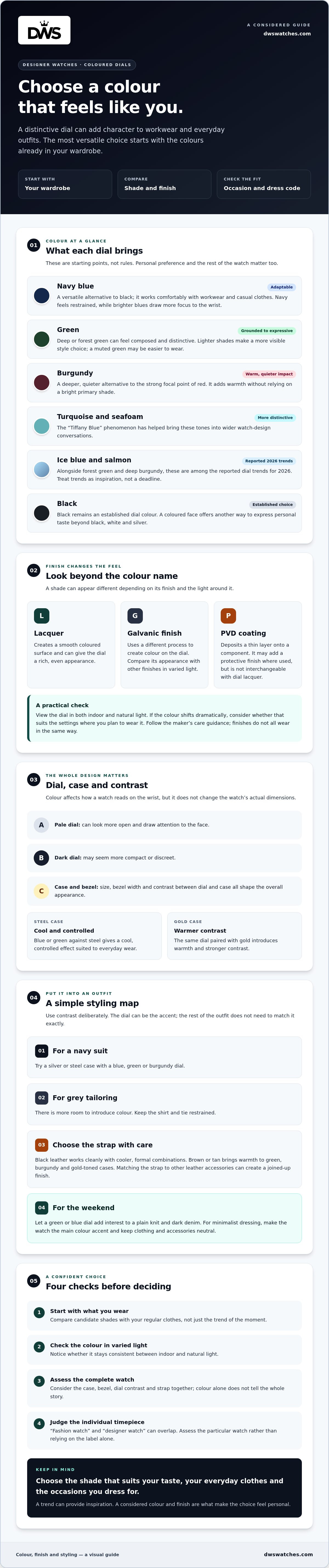
Emerald, navy and burgundy offer different ways to move beyond black, white and silver. Deep green feels grounded, navy remains easy to coordinate, and burgundy adds warmth without relying on a bright primary shade. These colours give designers a broader palette for creating recognisable styles. The continuing influence of the “Tiffany Blue” phenomenon has also helped bring turquoise and seafoam tones into wider conversations about watch design.
Finishing affects how those colours hold their character. Lacquer creates a smooth, coloured surface and can produce a rich, even appearance. Galvanic finishes use a different process to create colour on the dial. PVD coating deposits a thin layer onto a component; it can add a protective finish where used, but it isn’t interchangeable with dial lacquer. For lasting visual appeal, check how the dial looks in varied light and follow the maker’s care guidance rather than assuming every finish wears in the same way.
Defining the Modern Coloured Dial
A coloured dial is any non-monochrome watch face finished with colour through a process such as galvanic treatment or lacquering. In this context, “fashion watch” often describes a timepiece chosen mainly as a style accessory, whilst “designer watch” points to a design identity associated with a fashion brand. The labels can overlap, so assess the individual watch rather than relying on the category alone. Colour consistency matters: a shade that shifts dramatically between indoor and natural light may not suit every setting.
Why 2026 is the Year of the Vibrant Face
For 2026, reported dial trends include forest green, deep burgundy, ice blue and salmon, alongside established blue and black. In professional settings, a considered dial colour can become part of personal style without overtaking an outfit. It may also prompt conversation at a networking event, particularly when its finish or shade is distinctive. Social media horology communities help circulate new releases and styling ideas, making emerging colours easier to spot and compare. Treat those trends as inspiration, not a deadline: choose a shade that works with your wardrobe and preferences.
Decoding the Aesthetic Impact of Dial Colours
Colour changes how a watch reads on the wrist. A pale dial can look open and draw attention to the face, whilst a dark dial may seem more compact or discreet. Neither effect changes the watch’s actual dimensions. Case size, bezel width and the contrast between dial and case also shape its appearance, so assess the whole design rather than judging colour alone.
Material matters. Blue or green against steel gives a cool, controlled effect that suits everyday wear. The same dial paired with gold introduces warmth and stronger contrast. For a balanced look, coordinate the case with jewellery or belt hardware, or let it stand apart deliberately. Watch history and design offers useful context on how the case and face work together as parts of a watch’s design.
Colour Psychology in Horology
Colour associations are personal, but these starting points can help narrow your choice:
- Blue: A versatile alternative to black. Navy feels restrained, whilst brighter blues bring more focus to the wrist.
- Green: Often associated with growth and stability. Deep green can feel composed; lighter shades make a more visible style choice.
- Red and burgundy: Red creates a strong focal point. Burgundy offers a deeper, quieter version of that impact.
Think about “complementary contrast” as a considered balance between the dial and the rest of your outfit. This might mean pairing a blue face with neutral clothing, or choosing a burgundy dial alongside a subtle warm accent. Avoid matching every colour exactly; a little separation keeps the combination intentional.
Wardrobe Coordination Strategies
For a navy suit, try a silver or steel case with a blue, green or burgundy dial. Grey tailoring gives you more room to introduce colour, while keeping the shirt and tie restrained. Leather straps add another layer: black works cleanly with cooler, formal combinations; brown and tan bring warmth to green, burgundy and gold-toned cases. Match the strap to your other leather accessories when you want a joined-up finish.
At the weekend, let the dial anchor a simple outfit. A green or blue face can add interest to a plain knit and dark denim without requiring extra colour elsewhere. The “single colour pop” rule is useful for minimalist dressing: make the watch the main accent, then keep clothing and accessories neutral. If you’re comparing designer watches with coloured dials, use that outfit as a practical test. A curated selection of designer watches with coloured dials can help you compare shades and finishes before choosing one that fits your wardrobe.
Comparing the Most Coveted Dial Hues for 2026
Choose a dial for your wardrobe and the occasions you dress for, not just the trend of the moment. Navy blue is usually the more adaptable option: it sits comfortably with workwear and casual clothes. Forest green feels more distinctive, but a muted shade can be just as easy to wear. For a quick test, compare each colour with your most-used jacket, shoes and accessories.
The Classic Palette: Blue and Silver
Blue remains a familiar coloured-dial choice because it offers an alternative to black without demanding a complete wardrobe change. Midnight blue looks restrained in lower light and works well for formal settings. Electric blue catches the eye and makes a stronger statement, so it may suit relaxed occasions better. A blue dial with a stainless-steel case creates a clean, balanced combination. Consider your skin’s undertone as a guide, not a rule: try cooler blues against cool undertones and brighter or warmer blues against warm undertones, then judge the effect in natural light.
The Contemporary Palette: Green and Earth Tones
Green has moved from a less familiar choice into the mainstream of current dial design. Saturated, “Hulk” greens bring high contrast and suit simple outfits; olive tones feel quieter and pair naturally with brown leather or neutral clothing. Earthy colours, including terracotta and brown, offer warmth without the intensity of brighter shades. They can work particularly well with gold-toned cases or tan straps.
Pastel and salmon dials add a softer option to the 2026 palette. Pale colours can feel light and understated, whilst salmon brings warmth and a noticeable shift from standard blue. Yellow and orange are more niche. Their vividness often suits sports-inspired designs and casual clothing, but they can dominate a formal outfit. Keep the rest of the look simple if the dial is bright.
Finish changes the impression, too. Sunray surfaces reflect light outwards, giving darker shades such as plum or chocolate more depth and movement. Matte finishes absorb more light and tend to look quieter. Compare both under different lighting before deciding; the colour that suits your usual setting is often more useful than the shade that looks best in a product image.
Use occasion as your final filter: choose navy or muted green for regular workwear, and reserve vivid green, yellow or orange for outfits with less competing detail. For brand examples and further options, explore best value designer watch brands UK. A curated look at designer watches with coloured dials can help you compare shades, case finishes and overall style in one place.
Technical Factors and Styling Considerations
A coloured dial’s finish affects both its appearance and how easily you can read the time. Look beyond the shade. Surface texture, crystal reflections and the contrast of the hands and markers all shape the result. These details matter particularly for designer watches with coloured dials, where colour is a central part of the design.
Dial Finishes and Light Interaction
Sunray: Fine lines radiate from the centre, catching light as the wrist moves. This gives the dial changing highlights and makes darker colours appear more dimensional.
Matte: A non-glossy surface reflects less light, creating a restrained look often associated with tool watches. It can make the dial easier to read in bright conditions, though legibility also depends on the hands and markers.
Sandblasted: A fine, textured surface scatters light rather than reflecting it in a focused sheen. The result is a more uniform, understated appearance than sunray.
Sapphire crystal is valued for its clear, hard-wearing surface, but reflections can affect how the dial colour appears. Anti-reflective (AR) coatings reduce glare and help the colour read more clearly. Coatings can sometimes add a subtle tint at certain angles, so view the watch in different lighting if possible. PVD is a coating process used on watch components to apply a surface layer; don’t assume it describes the dial finish itself. Check the maker’s description for the specific materials and treatments used.
Case and Strap Compatibility
Silver-toned steel generally pairs neatly with cooler dial shades such as blue, while gold brings warmth to green or chocolate tones. These are useful starting points, not strict rules. Consider the whole combination, including skin tone, clothing and other jewellery.
Check contrast before choosing. Silver or white markers against a pale dial may be harder to distinguish, whilst dark hands can disappear against a dark face. Look for clear separation between the dial, indices and handset. A date window also deserves attention: a disc that matches the dial colour can create a more integrated appearance, while a contrasting date wheel may draw focus. Neither is inherently better; choose the effect you prefer.
An integrated bracelet can make a coloured dial feel like part of one continuous design, especially with a steel case. Leather offers a different balance and can soften the look. Try black for a formal finish, or brown leather with warmer dial shades. Check that strap and case tones work together rather than competing for attention.
Compare finishes, contrast and case details across a curated range of designer watches with coloured dials to find a combination that suits your style.
Navigating the Curated Selection at Designer Watch Store UK
Buying online gives you time to compare dial colours, finishes and case details side by side. A specialised retailer can make that search more focused by bringing designer watches together in one place, rather than asking you to browse across unrelated categories. Designer Watch Store UK operates exclusively online and curates authentic designer timepieces, with a selection chosen to meet modern aesthetic standards.
The Digital Curation Advantage
A physical shop is limited by the space available to display watches. An online catalogue can make it easier to compare the styles listed without travelling between retailers. Use product descriptions and images to narrow your options, but remember that screen settings and lighting can affect how a colour appears. Check the details carefully, and compare a dial’s stated colour, finish and case material before deciding.
Curation helps reduce the noise. Rather than treating every seasonal shade as essential, focus on designs that fit your wardrobe and regular occasions. If a particular colour is important to you, check current product listings: availability can change, and not every shade will be in stock at the same time.
Securing Value in the Designer Market
Discounted designer watches can make colour experimentation more approachable. If you usually wear black or silver, a considered move to blue, green or burgundy can add variety without committing to a highly unusual shade. A second watch can also serve a different purpose, such as adding a brighter accent to weekend outfits. Choose based on how often you expect to wear it, not just its place in a trend cycle.
Value still depends on confidence in what you’re buying. Look for clear information about the watch and its seller. Check that the product is described as authentic, review the retailer’s terms and policies, and make sure the details on the listing match the model you’re considering. Designer Watch Store UK specialises in authentic designer watches and focuses on competitive pricing, but don’t assume that a discount alone proves authenticity.
For more guidance on balancing value with brand choice, read affordable designer watches UK. A focused approach can help you build a varied collection over time, choosing each piece for its design and usefulness rather than chasing every new colour.
The retailer serves a national UK audience, with a focus on UK delivery. Before completing an order, review the delivery information shown at checkout, including the terms that apply to your destination. This keeps the process clear and lets you make a considered choice from home.
Choose a Dial That Works Beyond the Trend
The right colour is the one you’ll wear with confidence. Let your wardrobe and regular occasions guide your choice, then compare the finish, case and markers to make sure the watch is as practical as it is distinctive. Sunray, matte and textured dials each create a different effect, so consider how yours looks in varied light.
Designer watches with coloured dials can bring personality to everyday style without requiring a complete wardrobe change. Start with a versatile shade, or choose a bolder colour when it feels true to your taste. Focus on authenticity and the details of each listing as you compare your options.
Designer Watch Store UK offers a specialised online selection of authentic designer brands, with national UK delivery. Explore our curated collection of designer watches and find a timepiece that feels right for your style. Make a considered choice, then wear it your way.
Frequently Asked Questions
Are coloured dials considered professional for office wear?
Yes, a coloured dial can suit office wear when its shade and finish fit your dress code. Navy, muted green and burgundy are considered choices that add interest without overpowering a tailored outfit. Pair them with a steel case and keep other accessories restrained for a balanced look. If your workplace is formal, choose a darker shade and check that the hands and markers remain easy to read.
Which dial colour is the most versatile for a first watch?
Navy blue is a strong first choice because it works with many neutral colours and sits between classic black and brighter shades. It can complement grey tailoring, denim and everyday knitwear. Consider the finish as well: a dark matte dial feels understated, whilst a sunray surface catches more light. If your wardrobe features warm colours, try muted green or brown before deciding.
Do coloured watch dials fade or discolour over time?
They can change in appearance over time, but the result depends on the materials, finish, exposure and care. Sunlight, heat and moisture may affect some finishes, so follow the manufacturer’s care guidance and avoid leaving a watch in prolonged direct sunlight. Don’t assume all coloured dials age in the same way. For a specific watch, check its product information and ask the retailer about the dial material and finish.
How do I pair a green dial watch with my clothes?
Pair a green dial with neutral clothing for an easy starting point. Forest green works with navy, grey, cream and black, whilst olive tones sit naturally alongside brown, tan and other earthy colours. For work, let the watch be the main colour accent and keep your tie or other accessories simple. With casual clothes, repeat a subtle warm or green tone elsewhere if you want a more coordinated effect.
Are designer watches with coloured dials more expensive than black ones?
Not necessarily. A dial’s colour alone doesn’t determine a watch’s price. Brand, materials, movement, design and market demand can all influence the asking price, and the same model may be offered in different colours. Compare like-for-like versions and review the retailer’s product details before deciding. If you’re considering a less common shade, check that the price difference reflects the specific watch rather than assuming colour always adds value.
What is the difference between a sunray and a matte dial?
A sunray dial has fine lines that radiate from the centre and reflect light as the watch moves. This creates shifting highlights and can make a dark colour look more layered. A matte dial has a low-reflective surface and a quieter appearance. It may be easier to read in bright light, depending on the contrast of its hands and markers. Compare both finishes under different lighting before choosing.
Can I change the strap on a coloured dial watch to make it more versatile?
Often, yes, if the watch is designed to accept a different strap. Check the attachment style, width and manufacturer’s guidance before buying a replacement, as not every strap fits every case. A black strap can make a bright dial feel more formal, whilst brown leather can warm up green or burgundy. Keep the case finish in mind, too, so the strap and metal details look considered together.
Why should I buy a designer watch from an online specialist?
An online specialist brings a focused selection of designer watches together, making it easier to compare brands, dial colours and finishes in one place. Designer Watch Store UK retails authentic designer timepieces through its online store and serves customers across the UK. Before ordering, review the product description, authenticity information, retailer policies and delivery terms. These checks help you choose with confidence and understand what to expect from your purchase.